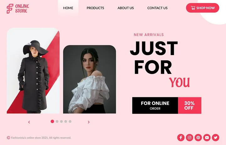
Figma has revolutionized the way designers create landing pages, offering a collaborative and versatile platform for UI/UX design. However, even experienced designers can fall into common traps when designing landing pages in Figma. A poorly designed landing page can negatively impact user engagement, conversions, and overall brand perception. To help you create effective and visually appealing landing pages, let’s explore some of the most common mistakes to avoid.
1. Ignoring the User Journey
A landing page should be designed with a clear understanding of the user journey. Many designers focus too much on aesthetics and neglect user experience (UX).
Solution: Before jumping into design, map out the user flow. Identify the main action you want visitors to take, such as signing up, making a purchase, or downloading an ebook. Use wireframes to test different structures before finalizing the design.
2. Overcomplicated Layouts
Complex layouts with excessive elements can overwhelm visitors and make navigation difficult. Simplicity is key to effective landing page design.
Solution: Keep the layout clean and structured. Use whitespace strategically to separate sections and guide users’ eyes to key elements, such as the CTA (Call to Action).
3. Poor Typography Choices
Typography plays a crucial role in readability and user engagement. Using too many fonts or inappropriate font sizes can make the content look unprofessional and hard to read.
Solution: Stick to a maximum of two complementary fonts—one for headings and another for body text. Maintain a proper text hierarchy by using different font weights and sizes.
4. Ignoring Mobile Responsiveness
Many users browse on mobile devices, yet some designers still fail to optimize their landing pages for different screen sizes.
Solution: Use Figma’s responsive design features such as auto layout, constraints, and breakpoints. Test your design across various screen sizes to ensure a seamless experience on all devices.
5. Weak Call to Action (CTA)
A CTA that is unclear, poorly placed, or not visually distinct can lead to lower conversions.
Solution: Make sure your CTA stands out with a contrasting color and large, bold text. Place it prominently above the fold and repeat it throughout the page where necessary.
6. Overuse of Images and Graphics
While images enhance visual appeal, excessive or irrelevant visuals can slow down page load speed and distract from the main message.
Solution: Use high-quality but optimized images. Ensure they align with the content and purpose of the landing page. Compress images using Figma plugins like TinyImage to improve loading speed.
7. Inconsistent Branding
A landing page should align with the brand’s identity. Using inconsistent colors, fonts, and styles can confuse visitors and weaken brand recognition.
Solution: Stick to brand guidelines and maintain consistency in color schemes, typography, and imagery. Use Figma components and styles to standardize elements across different pages.
8. Cluttered Navigation
A landing page should have minimal navigation to keep users focused on the primary goal. Adding too many menu items can distract visitors from converting.
Solution: Limit navigation links to only the essential ones, such as a sign-up button or a simple footer. If additional information is necessary, use collapsible menus or sections.
9. Ignoring Contrast and Readability
Low contrast between text and background can make content difficult to read, reducing engagement and accessibility.
Solution: Use Figma’s contrast checker to ensure proper readability. Aim for a contrast ratio of at least 4.5:1 for standard text and 3:1 for larger text.
10. Lack of A/B Testing
Many designers finalize a landing page without testing different variations, missing opportunities to optimize performance.
Solution: Create multiple versions of key elements, such as CTA buttons, headlines, and images. Use A/B testing tools to determine which design converts best.
11. Forgetting About Accessibility
Ignoring accessibility can alienate a portion of your audience, including those with visual impairments or disabilities.
Solution: Use Figma’s accessibility plugins to check color contrast, text legibility, and keyboard navigation. Provide alt text for images and ensure buttons have clear labels.
12. Poor Use of Auto Layout
Manually positioning elements can make scaling and adjusting designs difficult, leading to inconsistencies.
Solution: Use Auto Layout in Figma to create flexible designs that adapt easily to different screen sizes and content changes.
13. Unoptimized Performance
Large file sizes, uncompressed images, and excessive elements can slow down Figma’s performance and impact collaboration.
Solution: Regularly optimize your Figma file by removing unused assets, using reusable components, and compressing images.
14. Skipping Prototype Testing
Not testing interactions and animations can lead to a poor user experience when the design is developed.
Solution: Use Figma’s prototyping features to test button clicks, hover effects, and page transitions before handing off the design to developers.
15. Ineffective Content Hierarchy
If users struggle to find key information due to poor structuring, they are less likely to take action.
Solution: Organize content logically with clear headings, subheadings, and bullet points. Prioritize the most important information at the top.
Conclusion
Designing an effective landing page in Figma requires attention to detail and a strong focus on user experience. By avoiding these common mistakes—such as neglecting mobile responsiveness, using poor typography, and not optimizing CTAs—you can create high-converting landing pages that engage users and drive results. Always test, iterate, and refine your designs to achieve the best performance.
My Fiver link for : Figma Landing Page Design Service


