
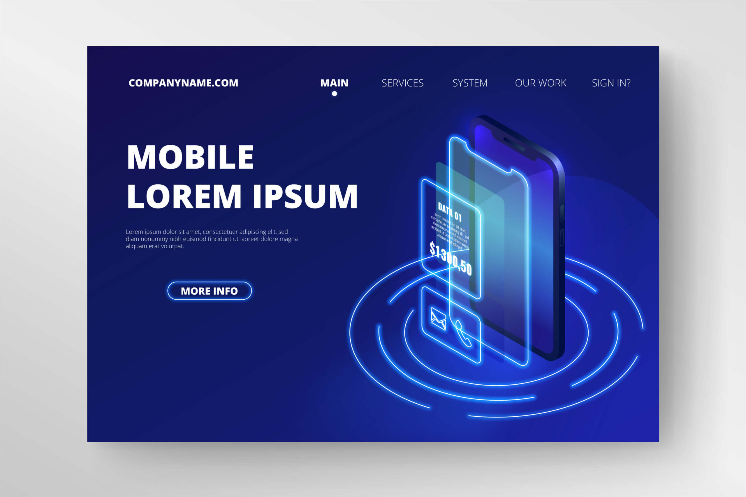
In the ever-evolving digital landscape, the shift from desktop to mobile has been nothing short of revolutionary. As smartphones become increasingly ubiquitous, designers and developers face the challenge of translating effective web design principles to the smaller, more intimate world of mobile apps. While the core tenets of good design remain constant, the mobile environment demands a nuanced approach that considers unique constraints and opportunities.
Understanding the Mobile Context
Before diving into specific design principles, it’s crucial to understand the context in which mobile apps are used. Unlike desktop experiences, which often involve a user sitting at a desk with full attention on the screen, mobile apps are used on-the-go, often in distracting environments, and with limited time and attention spans. This context shapes every aspect of mobile app design.
Key Differences:
- Screen size and resolution
- Touch-based interaction vs. mouse and keyboard
- Variable network connectivity
- Limited processing power and battery life
- Diverse usage environments (e.g., bright sunlight, one-handed use while walking)
With these factors in mind, let’s explore how fundamental web design principles can be effectively translated to mobile app design.
1. Simplicity and Focus
Web Principle: Keep it simple and focused.
Mobile Application: Embrace minimalism and prioritize core features.
In web design, simplicity helps users navigate complex information structures. For mobile apps, this principle becomes even more critical. The limited screen real estate demands ruthless prioritization of features and content.
Tips for Mobile:
- Identify and highlight the app’s core functionality
- Use progressive disclosure to reveal additional options when needed
- Implement a “mobile-first” design approach, starting with essential elements and adding complexity only when necessary
2. Visual Hierarchy
Web Principle: Guide users through content with clear visual hierarchy.
Mobile Application: Optimize for scannability and quick information retrieval.
Effective visual hierarchy is crucial on both web and mobile platforms, but mobile users often seek information more quickly and in more distracting environments.
Tips for Mobile:
- Use larger fonts for primary information
- Implement contrasting colors to highlight important elements
- Utilize whitespace effectively to separate content sections
- Consider using cards or list views for easily scannable content
3. Navigation and Information Architecture
Web Principle: Create intuitive navigation systems.
Mobile Application: Simplify navigation for touch and limited screen space.
While websites often use complex navigation menus, mobile apps require streamlined, touch-friendly navigation systems that work well on smaller screens.
Tips for Mobile:
- Implement a bottom navigation bar for primary app sections
- Use a hamburger menu or tab bar for secondary navigation
- Consider gesture-based navigation for common actions (e.g., swipe to go back)
- Ensure that touch targets are large enough (at least 44×44 pixels)
4. Responsive Design
Web Principle: Design for various screen sizes and orientations.
Mobile Application: Optimize for different mobile devices and orientations.
Responsive design is a cornerstone of modern web development. For mobile apps, this principle extends to accommodating various device sizes and both portrait and landscape orientations.
Tips for Mobile:
- Use flexible layouts that adapt to different screen sizes
- Design for both portrait and landscape orientations when appropriate
- Utilize adaptive layouts that reorganize content based on available space
- Test your designs on multiple devices and screen sizes
5. Loading Times and Performance
Web Principle: Optimize for fast loading times.
Mobile Application: Prioritize performance and perceived speed.
Fast loading times are crucial for both web and mobile experiences, but mobile users are often even more impatient and may be dealing with slower network connections.
Tips for Mobile:
- Optimize images and assets for mobile devices
- Implement lazy loading for content that’s not immediately visible
- Use skeleton screens or loading animations to improve perceived performance
- Cache data locally when possible to reduce network requests
6. Consistency and Familiarity
Web Principle: Maintain consistency in design elements and interactions.
Mobile Application: Adhere to platform-specific design guidelines while maintaining brand consistency.
Consistency in web design helps users navigate and interact with a site efficiently. For mobile apps, this principle extends to following platform-specific guidelines (iOS or Android) while maintaining brand identity.
Tips for Mobile:
- Follow platform-specific design guidelines (Material Design for Android, Human Interface Guidelines for iOS)
- Use familiar icons and interaction patterns
- Maintain consistent branding elements across platforms
- Adapt your brand’s color scheme to ensure readability on mobile screens
7. Accessibility
Web Principle: Design for users of all abilities.
Mobile Application: Leverage built-in accessibility features and design for diverse interaction methods.
Accessibility is crucial for both web and mobile design, but mobile platforms often provide additional tools and features to support users with disabilities.
Tips for Mobile:
- Support system-level accessibility features (e.g., VoiceOver, TalkBack)
- Ensure sufficient color contrast for text and interactive elements
- Provide alternative text for images and icons
- Design for various input methods (touch, voice, external keyboards)
8. Content Strategy
Web Principle: Craft compelling and scannable content.
Mobile Application: Optimize content for mobile consumption and context.
While concise, scannable content is important for websites, it becomes absolutely critical for mobile apps where users have even less patience for lengthy text.
Tips for Mobile:
- Use clear, concise language
- Break content into easily digestible chunks
- Utilize progressive disclosure to reveal additional information when needed
- Consider the mobile context when crafting content (e.g., location-based information)
9. User Feedback and Micro-interactions
Web Principle: Provide clear feedback for user actions.
Mobile Application: Utilize haptic feedback and animations for a more tactile experience.
Feedback is important on all platforms, but mobile devices offer unique opportunities for creating a more physical, tactile interaction through haptic feedback and subtle animations.
Tips for Mobile:
- Use subtle animations to provide visual feedback for user actions
- Implement haptic feedback for important interactions
- Design micro-interactions that delight users and enhance the overall experience
- Ensure that feedback is quick and doesn’t hinder app performance
Conclusion
Translating web design principles to mobile app design requires a deep understanding of the mobile context and user behavior. While the core principles of good design remain constant, their application must be adapted to suit the unique constraints and opportunities presented by mobile devices.
By focusing on simplicity, optimizing for performance, and designing for touch-based interactions, designers can create mobile apps that not only meet users’ needs but also delight them with smooth, intuitive experiences. As the lines between web and mobile continue to blur, mastering the art of translating design principles across platforms will become an increasingly valuable skill for designers in our digital-first world.
Devoq Design is a leading UI/UX design agency with a strong presence in both the Central Coast and Wollongong. As a premier UI/UX design agency in the Central Coast, Devoq Design specializes in creating visually compelling and user-friendly digital experiences that cater to the unique needs of local businesses. Similarly, as a top UI/UX design agency in Wollongong, Devoq Design excels in delivering innovative design solutions that enhance user engagement and satisfaction. With a team of skilled designers committed to excellence, Devoq Design ensures that each project is tailored to meet the specific requirements of their diverse clientele, driving growth and success in both regions.


