
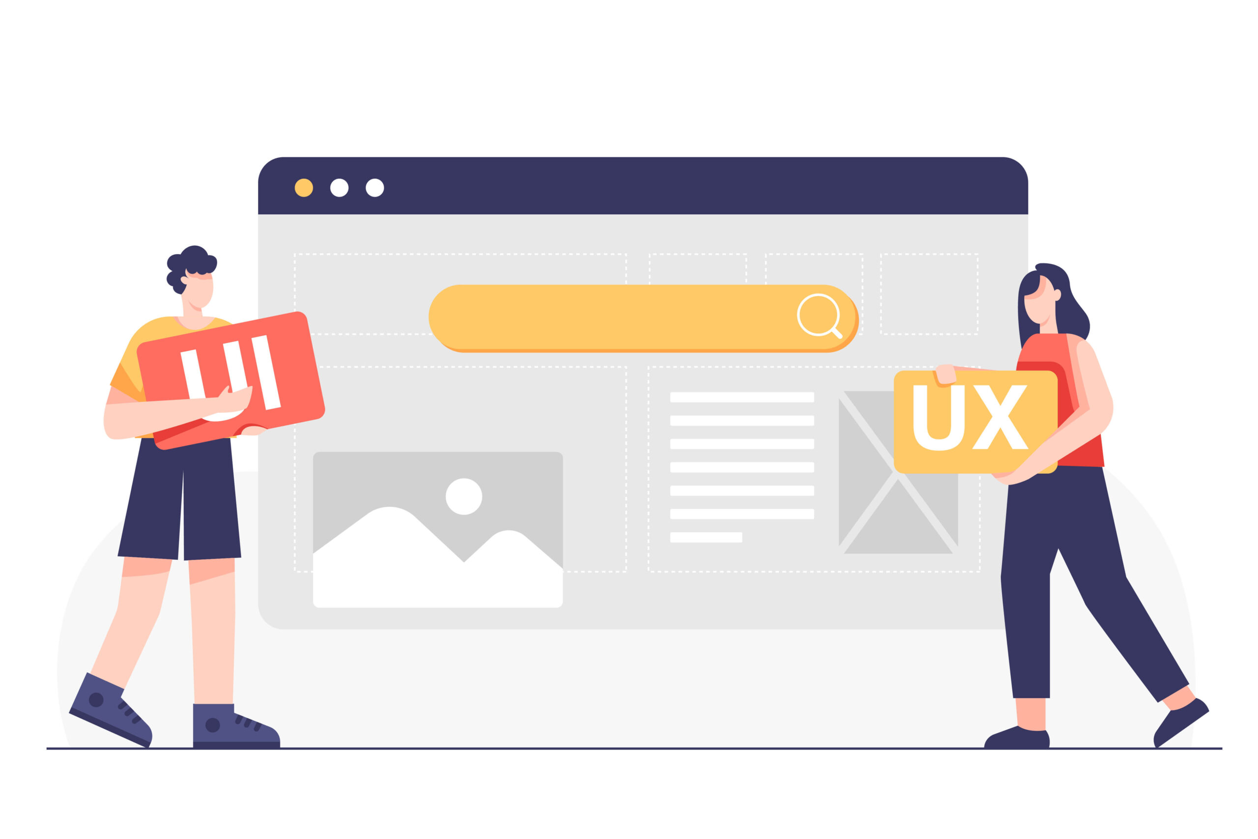
In today’s digital era, users expect seamless experiences, whether they’re browsing a website on a desktop or interacting with an app on their smartphone. However, harmonizing User Interface (UI) and User Experience (UX) principles across web and mobile platforms presents unique challenges. Ensuring consistency while adapting to different devices is crucial for delivering a unified brand experience. In this article, we’ll explore the importance of bridging the gap between web and mobile UI/UX, the challenges involved, and strategies to achieve a cohesive design across platforms.
Understanding UI/UX Design Principles
Before diving into cross-platform challenges, it’s essential to understand what UI and UX entail. UI refers to the aesthetic and interactive aspects of a product—the buttons, icons, and layout that users interact with. UX, on the other hand, encompasses the overall experience users have while interacting with a product, including ease of use, efficiency, and satisfaction.
While UI and UX are often intertwined, they serve different purposes. UI focuses on the visual and interactive elements, while UX is concerned with the user’s journey and overall satisfaction. Balancing these principles is key to creating designs that work across both web and mobile platforms.
The Evolution of Web and Mobile Platforms
Web design has come a long way from the early days of static pages and minimal interaction. As technology advanced, so did the complexity and capabilities of websites. The rise of smartphones introduced a new challenge—designing for smaller screens and touch-based interactions. This shift demanded a rethinking of traditional web design principles, leading to the development of mobile-specific UI/UX practices.
The evolution of these platforms has significantly impacted how designers approach UI/UX. Web design, traditionally focused on large screens and mouse navigation, had to adapt to the constraints and opportunities of mobile platforms. This evolution highlighted the need for a unified approach to design that works across multiple devices.
Challenges in Harmonizing UI/UX Across Platforms
Designing for both web and mobile is not without its challenges. One of the primary issues is the difference in screen sizes and resolutions. A design that looks great on a desktop may not translate well to a smartphone. Additionally, user behavior differs between platforms—users may expect different navigation styles or interaction methods depending on whether they’re on a web or mobile platform.
Technical constraints also play a role. Mobile devices, with their limited processing power and battery life, require optimized designs that can perform well under these conditions. These challenges necessitate a thoughtful approach to design, ensuring that both web and mobile versions of a product provide a consistent yet optimized experience.
Responsive and Adaptive Design
Responsive and adaptive design are two approaches that help unify UI/UX across platforms.
Responsive design : ensures that a website’s layout adjusts fluidly to different screen sizes, providing a consistent experience regardless of the device. This approach relies on flexible grids and media queries to adapt the design dynamically.
Adaptive design : on the other hand, involves creating multiple versions of a site or app, each tailored to a specific device or screen size. Instead of one fluid layout, the site detects the user’s device and loads the appropriate version. While this can result in a more customized experience, it requires more resources and maintenance.
Both approaches have their merits, and choosing between them depends on the specific needs of the project. Responsive design is often preferred for its simplicity and ease of implementation, but adaptive design can provide a more tailored user experience.
Navigation and User Flow
Navigation is a critical aspect of UI/UX design, and it varies significantly between web and mobile platforms. On the web, users are accustomed to multi-level menus, breadcrumbs, and hover effects. Mobile navigation, however, often relies on simpler, more intuitive gestures like swiping and tapping.
To create a seamless user flow, designers must consider how users move through a product on different platforms. This involves ensuring that key actions are easy to find and perform, regardless of the device. A well-designed navigation system should feel natural and intuitive, guiding users through the product without friction.
Visual Design Considerations
Visual consistency across platforms is essential for maintaining a unified brand experience. However, this doesn’t mean using the exact same design elements on both web and mobile. Instead, designers should adapt visual elements to suit the platform while keeping the overall aesthetic consistent.
Typography, color schemes, and iconography should be carefully chosen to work well on both large and small screens. For instance, text may need to be larger and more readable on mobile devices, while buttons might need to be more touch-friendly. By adapting these elements, designers can ensure that the visual design is effective and engaging on all platforms.
Interactive Elements and User Engagement
Interactivity is a key component of modern UI/UX design, and it plays out differently on web and mobile platforms. Desktop users typically interact with a mouse or keyboard, while mobile users rely on touch. These differences require thoughtful adaptation of interactive elements.
For example, hover effects that work well on desktop don’t translate to mobile, where touch is the primary mode of interaction. Designers must find alternative ways to convey the same information or interaction on mobile. Additionally, mobile devices offer unique opportunities for engagement through features like gestures and motion sensing, which can enhance the user experience.
Performance Optimization
Performance is a critical factor in user satisfaction, and it varies between web and mobile platforms. Mobile devices, with their limited resources, require optimized designs that load quickly and perform smoothly. This means compressing images, minimizing scripts, and ensuring that the design is as lightweight as possible.
For web platforms, performance optimization involves ensuring fast load times, especially for users on slower internet connections. Techniques like lazy loading, caching, and content delivery networks (CDNs) can help improve performance. By optimizing for performance, designers can ensure that users have a smooth, enjoyable experience regardless of the platform.
Future Trends in Cross-Platform UI/UX Design
The future of UI/UX design will likely be shaped by emerging technologies such as artificial intelligence (AI), augmented reality (AR), and virtual reality (VR). These technologies will introduce new challenges and opportunities for cross-platform design, requiring designers to rethink how they approach UI/UX.
For example, as AR and VR become more mainstream, designers will need to consider how to create immersive experiences that work across multiple devices and platforms. AI can also play a role in personalizing experiences, allowing for more adaptive and responsive designs.
Conclusion
Harmonizing UI/UX principles across web and mobile platforms is essential for delivering a consistent, engaging user experience. By understanding the unique challenges of each platform and adopting strategies like responsive design, designers can create cohesive experiences that resonate with users, regardless of the device they’re using. As technology continues to evolve, staying ahead of trends and continuously refining designs will be key to bridging the gap between web and mobile UI/UX.
Devoq Design is a premier UI/UX design agency with a strong presence in both Jaipur and Jodhpur. As a leading UI/UX design agency in Jaipur, Devoq Design specializes in crafting visually stunning and user-centric digital experiences that cater to the unique needs of local businesses. Similarly, as a top UI/UX design agency in Jodhpur, Devoq Design excels in delivering innovative design solutions that enhance user engagement and satisfaction. With a team of skilled designers dedicated to excellence, Devoq Design ensures that each project is tailored to meet the specific requirements of their diverse clientele, driving growth and success in both cities.


