Picture this: you spend hours creating the ideal website, only to discover that people depart within seconds. No clicks, no sales, just silence. It happens more often than you think. The reason? A poorly designed landing page.But what if you could create a landing page that stops people in their tracks? One that makes them take action
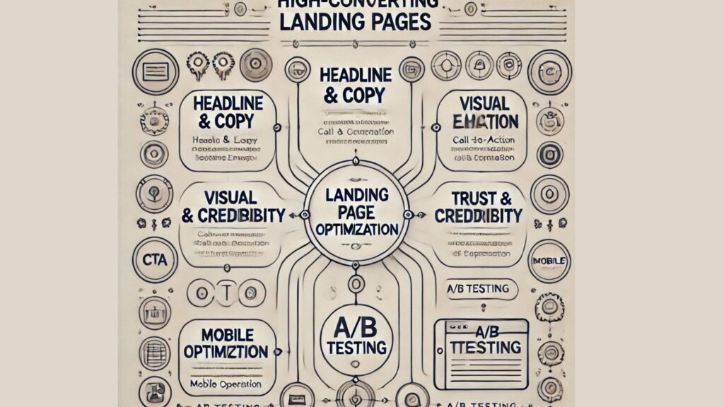
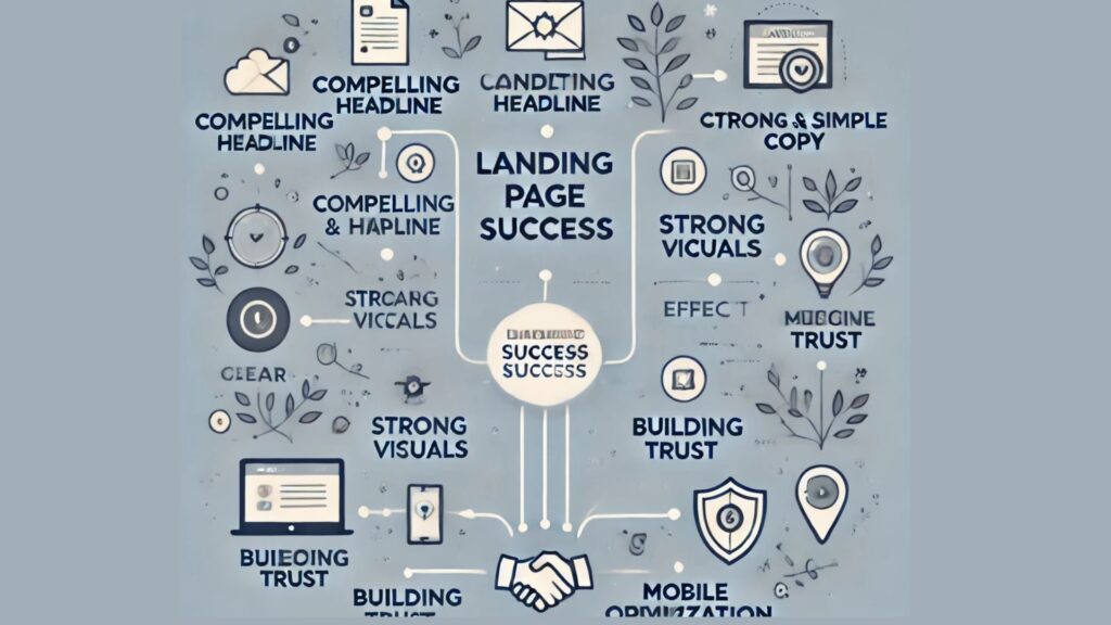
A Headline That Grabs Attention
People decide within seconds whether to stay or leave. Your headline is the first thing they see, so make it count.Example: Instead of saying, “Get Our Marketing Guide,” say, “Boost Your Sales with This Free Marketing Guide”. The second one speaks directly to the visitor’s needs.
Clear and Simple Copy
Avoid unnecessary fluff. Tell visitors exactly what they’re getting and why it matters. They’ll leave if they have to work too hard to understand your offer.Example: Instead of writing, “Our innovative strategies will help you maximize revenue and engagement,” say, “Learn how to increase sales with proven marketing tips.”
The Power of Visuals
Have you ever landed on a page filled with too much text? It’s overwhelming.Images, videos, and color choices influence people’s feelings about your offer. A clean, straightforward design keeps visitors focused on what matters.
Use a High-Quality Image or Video
People process visuals faster than text. A great image or video can quickly communicate what your page is about.Real-Life Example:By adding an explanatory film to their landing page, Dropbox was able to increase sign-ups by 10%. Instead of expecting users to read long descriptions, they showed how their product worked in a short clip.
Keep the Layout Simple
Cluttered pages confuse people. Too many buttons, links, or distractions distract visitors from the primary goal. Make sure to use a simple design with a lot of white space.
Call-to-Action: The Make-or-Break Element
Your call-to-action (CTA) is where visitors decide whether to engage or leave. A weak CTA means lost conversions.
Use Action-Driven Words
Instead of “Submit” or “Click Here,” use buttons that tell visitors exactly what they’ll get.Examples:
Bad CTA: “Sign Up”
Good CTA: “Get Your Free Guide Now”
Make Your CTA Stand Out
Your CTA button should be easy to find. Use a bold color that contrasts with the background and keep the text large enough to read at a glance.
Building Trust Instantly
People don’t give away their email or credit card details to anyone. You need to prove your credibility.
Social Proof Matters
When visitors see others benefiting from your product, they feel more confident taking action. This can be done through:
Customer reviews
Testimonials
Case studies
Trust badges (e.g., “As Seen On” logos)
Remove Any Doubts
People hesitate when they have unanswered questions. Reduce their concerns with:
A FAQ section to address common doubts
A money-back guarantee to lower risk
Transparent pricing (if applicable) so they know what to expect
Mobile Optimization: Don’t Ignore It
Most users browse on their phones. If your landing page isn’t mobile-friendly, you’re losing potential customers.
Make It Load Fast
Slow pages make visitors leave. Optimize images, reduce unnecessary elements, and use a fast hosting provider.
Keep Forms Short
No one wants to fill out a long form on their phone. Only ask for the necessary details—name and email are often enough.
A/B Testing: The Secret to Higher Conversions
Even the best landing pages can improve. A/B testingallows you to find out which of two versions of a page is more effective.
What to Test?
Headlines: Try different wording to see which gets more attention.
CTA Button Colors: Changing a button from blue to red sometimes increases clicks.
Images vs. Videos: See which format keeps visitors engaged longer.
How to Track Results?
You can use tools such as Google Analytics or Hotjar to find out where people are clicking, how long they stay on your site, and where they leave.A high-converting landing page isn’t about luck. It’s about understanding what your visitors want and making it easy for them to take action.
FAQs:
1. What is a landing page?
A landing page is a standalone webpage designed to encourage visitors to take a specific action, such as signing up or making a purchase.
2. How long should my landing page be?
It depends on your offer. Keep it as short as possible while providing enough details to convince visitors to take action.
3. What’s the most important part of a landing page?
The headline, call-to-action, and visuals play the biggest roles in converting visitors.
4. Should I use video on my landing page?
Yes, videos can help explain your offer quickly and increase engagement.
5. How do I know if my landing page is working?
Track conversions, bounce rates, and A/B test different elements to see what performs best.


 Have you ever landed on a page filled with too much text? It’s overwhelming.Images, videos, and color choices influence people’s feelings about your offer. A clean, straightforward design keeps visitors focused on what matters.
 Most users browse on their phones. If your landing page isn’t mobile-friendly, you’re losing potential customers.


