
Choosing the right upholstery fabric color for your home can feel overwhelming, especially when you’re dealing with the unique lighting conditions found across the UK. From the grey skies of Scotland to the softer light of southern England, understanding how different colors interact with our natural light can make all the difference in creating a comfortable, welcoming space.
The truth is, what looks stunning in a bright showroom might appear completely different once it’s in your living room. This happens because UK lighting tends to be cooler and more subdued than in many other parts of the world, which affects how we perceive colors in our homes.
Understanding UK Natural Light Conditions
British weather is famous for being unpredictable, but one thing remains fairly consistent – our natural light tends to be softer and more diffused than in sunnier climates. This happens because of our frequent cloud cover, which acts like a giant softbox, filtering the sunlight before it reaches our windows.
During winter months, the situation becomes even more pronounced. With shorter days and lower sun angles, our homes rely heavily on artificial lighting for much of the day. This creates a unique challenge when selecting upholstery colors that need to look good in both natural daylight and various types of indoor lighting.
The northern parts of the UK experience even more dramatic seasonal changes in light quality. In Scotland and northern England, summer days can stretch well into the evening with beautiful, clear light, while winter days might feel perpetually overcast.
How Cool Light Affects Fabric Appearance
Cool lighting, which is characteristic of UK conditions, tends to enhance blue undertones while suppressing warm colors like reds and yellows. This means that a warm beige fabric might appear more grey or even slightly purple under typical UK lighting conditions.
This effect is particularly noticeable with neutral colors. What manufacturers call “warm white” or “cream” can look surprisingly cold and unwelcoming in British homes, especially during winter months. The same principle applies to colors across the spectrum – cool light can make warm colors appear muted and cool colors appear more vibrant.
Understanding this phenomenon helps explain why some popular fabric colors from other countries don’t translate well to UK interiors. It’s not that the colors are wrong, but rather that they’re fighting against our natural lighting conditions instead of working with them.
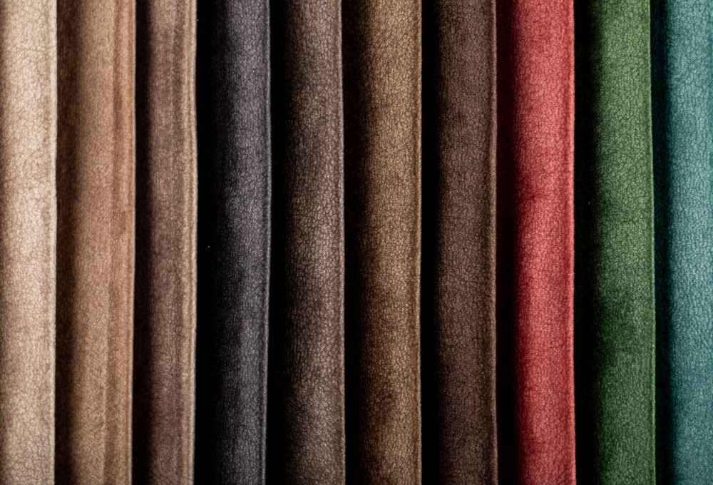
Warm colors That Thrive in British Homes
Despite the challenges posed by cool lighting, warm colors can work beautifully in UK homes when chosen carefully. Rich, deep warm tones tend to perform better than pale, warm colors because they have enough intensity to maintain their character even under cool light.
Terracotta, burnt orange, and deep rust colors can add much-needed warmth to British interiors. These colors have enough red undertones to resist the cooling effect of our natural light, while providing the psychological warmth that’s so welcome during long winter months.
Warm browns and chocolates also work well, particularly those with red or golden undertones rather than grey undertones. A rich cognac leather or deep caramel fabric can anchor a room and provide a sense of cosiness that feels perfectly suited to UK living.
Golden yellows, when chosen in deeper, more saturated tones, can brighten British interiors without appearing washed out. Think mustard rather than pale butter, or ochre rather than lemon.
Cool colors That Complement UK Lighting
Cool colors naturally harmonise with UK lighting conditions, but this doesn’t mean you should automatically choose them. The key is selecting cool colors that enhance rather than exaggerate the already cool tone of British light.
Soft blues work particularly well, especially those with grey undertones that echo our frequently overcast skies. These colors can make a room feel calm and spacious, which is particularly valuable in smaller British homes.
Green tones, especially those inspired by the British countryside, feel completely at home in UK interiors. Sage greens, forest greens, and even deeper emerald tones can create a connection with the natural landscape outside while working harmoniously with our lighting conditions.
Purple tones, from soft lavender to deep plum, also thrive in cool light. These colors can add sophistication and depth to a room without fighting against the natural lighting conditions.
The Power of Neutral Tones
Neutrals might seem like the safe choice, but they’re actually quite complex when it comes to UK lighting. The wrong neutral can make a room feel cold and unwelcoming, while the right one can create a perfect backdrop for British living.
Grey is perhaps the most challenging neutral for UK homes because it can easily amplify the cool, sometimes gloomy feeling of overcast days. However, warm greys with brown or beige undertones can work beautifully, providing sophistication without coldness.
Taupe and mushroom colors often work better than true beiges in British homes. These colors have enough grey in them to harmonise with our lighting while maintaining enough warmth to feel welcoming.
Off-whites and creams need to be chosen very carefully. Those with pink or yellow undertones often appear muddy under UK lighting, while those with slight grey undertones tend to look cleaner and more contemporary.
Seasonal Considerations for Fabric Selection
British homes experience dramatic seasonal changes in lighting quality and quantity, which affects how upholstery colors appear throughout the year. Summer brings longer days and brighter, clearer light that can handle more delicate colors, while winter’s shorter, darker days call for colors that can maintain their impact under artificial lighting.
Consider how your main living spaces are used seasonally. A sitting room that’s primarily used in the evenings during winter will experience very different lighting conditions than a conservatory that captures maximum daylight year-round.
Some homeowners choose to embrace these seasonal changes by selecting colors that transform subtly throughout the year. A fabric that appears soft blue-grey in winter light might reveal green undertones in bright summer sunshine, adding visual interest and connection to the changing seasons.
Regional Variations Across the UK
Different regions of the UK experience notably different lighting conditions, which should influence upholstery color choices. Southern England generally receives more direct sunlight and experiences less dramatic seasonal variation than northern regions.
Scottish homes, particularly in the Highlands, must contend with very long winter nights and brief but intensely bright summer days. This extreme variation often favours colors that can perform well under artificial lighting while not being overwhelmed by bright summer light.
Coastal areas throughout the UK benefit from reflected light off water, which can be both brighter and slightly different in quality than inland locations. This reflected light often has a slight blue cast that can enhance cool colors while requiring careful selection of warm tones.
Urban areas, with their mix of artificial lighting and potential obstruction of natural light by surrounding buildings, present their own challenges that might favour different color choices than rural locations.
Practical Tips for Testing colors
The most important step in selecting upholstery colors for UK lighting is proper testing. Never make final decisions based on small samples viewed under shop lighting, which is typically much brighter and different in quality than home lighting.
Take large samples home and live with them for at least a week, observing how they look at different times of day and under various lighting conditions. Pay particular attention to how colors appear during the times when you’ll be using the room most frequently.
Test colors against your existing décor and architectural features. A color that looks perfect in isolation might clash horribly with your wooden floors or painted walls under UK lighting conditions.
Consider the room’s orientation and window placement. North-facing rooms receive very different light than south-facing ones, and this difference is more pronounced in the UK than in many other countries due to our latitude.
Conclusion
Selecting the right uph fabric colors for UK lighting doesn’t have to be complicated, but it does require understanding how our unique lighting conditions affect color perception. The key is working with, rather than against, the natural characteristics of British light.
Whether you’re drawn to warm colors that provide psychological comfort during grey days, cool colors that harmonise with our natural lighting, or carefully chosen neutrals that provide a sophisticated backdrop, success comes from proper testing and understanding your specific home’s lighting conditions.
For those looking to explore a wide range of upholstery options suited to British homes, Yorkshire Fabric Shop offers an extensive collection of fabrics specifically curated for UK interiors. Based in the heart of England, they understand the unique challenges of decorating in British light and can provide expert guidance on color selection for your specific needs.
Remember that the best upholstery color is one that makes you feel comfortable and happy in your home, regardless of lighting conditions. Trust your instincts, but arm yourself with knowledge about how UK lighting affects your choices.
Frequently Asked Questions
Q: Do darker colors work better than lighter colors in UK homes?
A: Not necessarily. While darker colors can be less affected by lighting variations, the key is choosing colors with the right undertones for UK lighting rather than focusing solely on depth. A well-chosen light color can work beautifully, while a dark color with wrong undertones might still look off.
Q: Should I choose different colors for north-facing versus south-facing rooms?
A: Yes, room orientation makes a significant difference in the UK. North-facing rooms receive cooler, more consistent light and often benefit from warmer color choices, while south-facing rooms get more varied light throughout the day and can handle a wider range of colors.
Q: How do I know if a neutral color will look good in UK lighting?
A: Test neutral colors extensively in your actual space. Look for neutrals with undertones that complement rather than fight UK lighting – warm greys often work better than cool greys, and off-whites with subtle grey undertones typically perform better than those with yellow or pink undertones.
Q: Can I use bright, vibrant colors in UK homes?
A: Absolutely! Vibrant colors can work wonderfully in UK homes, often providing much-needed energy during grey winter months. The key is choosing colors that maintain their vibrancy under cool lighting conditions and testing them thoroughly in your specific space.
Q: How important is artificial lighting when choosing upholstery colors?
A: Very important, especially during UK winters when artificial lighting dominates for much of the day. Consider the type and quality of your artificial lighting when making color choices, and remember that LED lights can affect color perception differently than traditional incandescent bulbs.
You can read: How to Choose a Wholesale Fabric Supplier UK For Your Business Needs